Components
How to create, use, and manage reusable template components in Board Game Builder — including template components, imported components, and using component within text.
Components
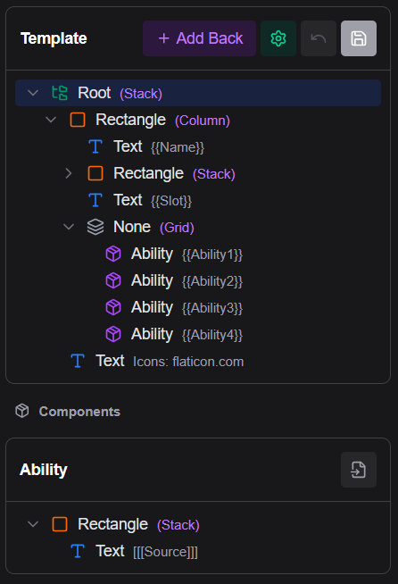
Components are reusable sub-templates that can be embedded inside any card template. They let you define a visual pattern once (e.g. a stat badge, a keyword icon row, an ability block) and reuse it across multiple templates or multiple times within a single template.
Types of components
| Type | Description |
|---|---|
| Template component | Defined directly inside the template file; not shared between templates |
| Imported component | Stored as a separate file in Google Drive; shareable across templates |
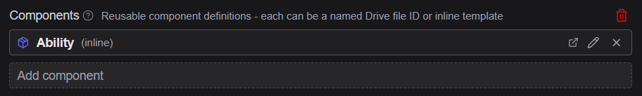
Template components
A component is initially created as an inside the current template and saved within it.
Creating a component
- In the element tree, find the element you want to turn into a component
- Click the button (Convert to component) while hovering the element.
- Enter a name for the component — e.g.
StatBadge
The selected subtree is moved into the Components section of the template, and a component reference replaces it in the tree. The reference node's Type is now set to the name of the new component.
Using a component
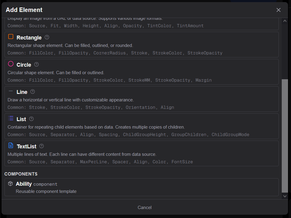
An components in your asset shows up as an option when adding a new element from the button in the template.
Editing a component
Components are shown in the Components section at the bottom of the template tree, grouped below the main tree. Click a component's elements to edit them normally. Changes to the component affect all usages.
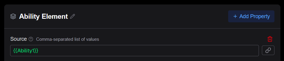
Property overrides
A component reference can include additional properties that override the corresponding properties in the component definition. This lets a single component have different colors, sizes, or source values per instance. It is recommended to use the Source property for the main customization of a component, since that allows using the component in text.
To pass information to the from a component reference node, add any property you want to override in the properties panel — for example, set Source to {{AbilityName}} on one reference and {{SpellName}} on another. This overridden property is then passed to the component overriding the existing value in the component (if any).
Imported components
An imported component is a component that has been saved to a separate template file stored in Google Drive. It can be referenced by name from multiple templates, making it shareable across assets.
Imported components have their own Undo and Save buttons separate from the main template.
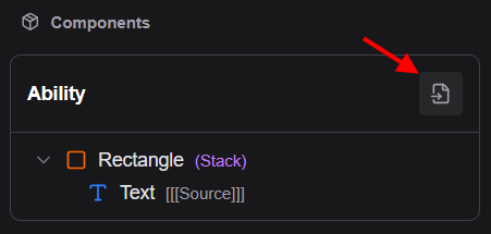
Saving a component as a file
From the Components section header, click the button (Save as file) to export a component into a standalone Drive file. After determining a filename and saving, the component becomes an imported component that other templates can also reference.
Adding an imported component
- In the element tree, click the button and in the Components property click the Add component button.
- In the Google Drive file picker select a file containing a previously saved component.
- The component loads and its tree appears in the Components section (4.) Optionally you can modify the given name of the component to be easier to reference using the button.
Components in text
A component can be used directly inside Markdown text using the self-closing tag syntax:
<ComponentName=SourceValue>This inserts a simplified inlined rendering of the components text and images. It is typically used for small icon images or symbol glyphs that should flow with the surrounding text while respecting color and other text properties.
Example:
Deals <Attack=4> damage
<ManaGem> Cost: {{ManaCost}}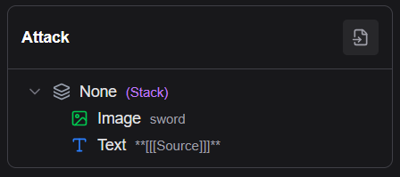
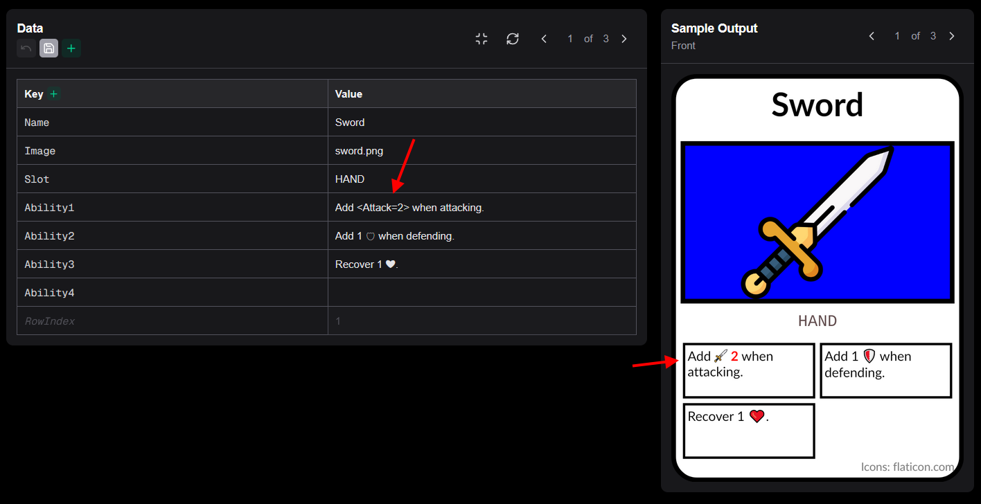
Source value
The =SourceValue part passes a single value to the component (accessible as [[Source]] inside the component root). If the component does not need a parameterized value, omit the = part:
<ManaGem>