Element Types Overview
An overview of all element types, how they compose in the tree, and the common properties shared across all element types.
Element Types Overview
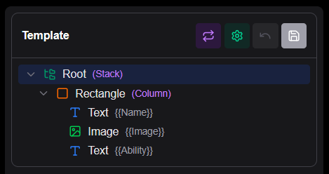
Elements are the building blocks of every card template in Board Game Builder. Each element has a type that determines its visual behaviour and available properties. Elements are arranged in a tree, with child elements rendered on top of their parent's bounding box. How the children are layouted is determined by the Mode property (Stack, Column...).
Built-in element types
| Type | Purpose |
|---|---|
| None | Invisible container just for grouping child elements |
| Text | A section of text with font, size, and color |
| Image | Image from a URL or data-bound source |
| Rectangle | Filled or outlined rectangle with optional rounded corners |
| Circle | Filled or outlined circle |
| Line | Horizontal or vertical rule |
| List | Repeating the inner template for each item in a list |
| Textlist | A text based on items in a list |
Common properties
These properties are available on all element types and control sizing, layout, and visibility.
| Property | Type | Description |
|---|---|---|
Width | number | Fixed width in millimeters |
Height | number | Fixed height in millimeters |
Mode | string | Layout mode for children |
Align | string | Alignment of content |
Rotation | string | Rotation angle for the element |
Margin | string/number | Spacing around the element in mm |
Border | string | Border width (mm) and color |
Condition | string | Expression — show the element only when truthy |
NotCondition | string | Inverse of Condition |
Cases | array | Case definitions for conditional rendering |
Pattern | string | Regex pattern and input for extracting data as [[PatternMatch]] |
Lookups | array | Lookup table definitions |
Layout properties (Mode-dependent)
These properties become available when the parent or current element uses a specific Mode.
| Property | Requires Mode | Description |
|---|---|---|
Spacing | Row or Column | Spacing between children in mm |
RelativeWeight | Row or Column | Relative weight for flexible sizing |
AutoWeight | Row | Automatically size based on content |
EvenChildren | Column | Divide available height equally among all children |
GridColumns | Grid | Number of columns in Grid mode |
ChildGroupHeight | Grid | Height of each row in Grid mode |
InnerBorderWidth | Grid | Width of borders between grid cells |
InnerBorderColor | Grid | Color of borders between grid cells |
Width
Width sets a fixed width for the element in millimetres, overriding the default sizing behaviour. When not set, elements are sized by their parent's layout rules. Use this when you need an element to be an exact width regardless of its content or parent size.
Height
Height sets a fixed height for the element in millimetres, overriding the default sizing behaviour. When not set, elements are sized by their parent's layout rules. Use this when you need an element to be an exact height regardless of its content or parent size.
Align
Align controls the alignment of content within the element's bounding box. Available values include None, Left, Center, Right, Top, Middle, and Bottom. The effect depends on the element type — for example, on a Text element it controls horizontal text alignment, while on an Image element it controls where the image sits within its container.
Rotation
Rotation rotates the entire element by the specified angle. Available values are None (no rotation), Left (90° counterclockwise), Right (90° clockwise), and Upside (180°). The rotation is applied after all other positioning and sizing, just before the element is rendered. This allows for creating rotated text and images.
Mode
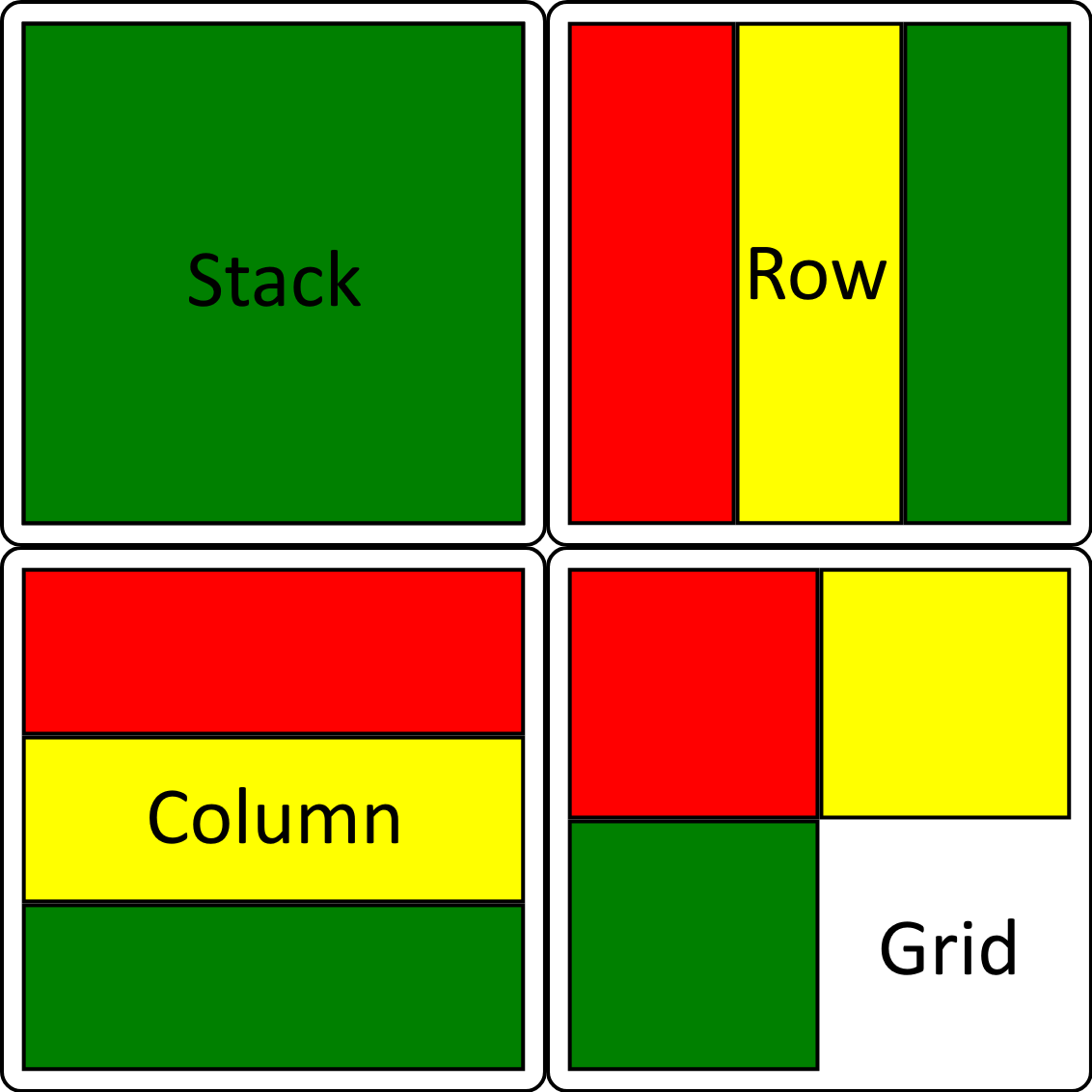
Mode controls how an element arranges its children. The default is Stack.
| Value | Description |
|---|---|
Stack | Children are layered on top of each other, like Photoshop layers. The first child is the base; each subsequent child is drawn above it. Use this for backgrounds, foreground overlays, and any composition where elements occupy the same space |
Row | Children are arranged horizontally in a single row, left-to-right |
Column | Children are arranged vertically in a single column, top-to-bottom |
Grid | Children are arranged in a 2D grid with a configurable number of columns, wrapping left-to-right then top-to-bottom |
Here three Rectangles (Red, Yellow, Green) are placed inside an element with the various Modes. Note that the Column example has been shown with EvenChildren enabled.
Margin
Margin adds space between the element's outer edge and its parent bounds or siblings. It accepts:
- A single number: equal margin on all four sides (e.g.
5) - An array of two values:
[vertical, horizontal]in mm (e.g.[4, 2]) - An array of four values:
[top, bottom, left, right]in mm (e.g.[4, 0, 2, 2])
Condition
Condition makes an element conditional — it is only rendered when the expression evaluates to true after all data references are resolved.
Two forms are supported:
Truthiness check (no operator) — the element is shown when the resolved string is non-empty and not the literal false:
Condition: "{{Type}}"          // show when Type is non-empty
Condition: "{{IsSpell}}"       // show when IsSpell is non-empty and not "false"
Comparison expression — write LEFT OPERATOR RIGHT where the operator is =, !=, >, or <. Both sides are resolved first, so you can use data references, constants, and nested references on either side:
| Operator | Behaviour |
|---|---|
= | String equality (case-insensitive) or numeric equality |
!= | String inequality (case-insensitive) or numeric inequality |
> | Numeric greater-than |
< | Numeric less-than |
Condition: "{{Type}}=Spell"         // show when Type equals "Spell"
Condition: "{{Type}}!=Creature"     // show when Type is not "Creature"
Condition: "{{Power}}>9000"         // show when Power is greater than 9000
Condition: "{{Cost}}<3"             // show when Cost is less than 3
Condition: "{{Level}}={{MinLevel}}" // compare two data columns
Elements with a failing Condition are completely skipped — they produce no output and take up no layout space.
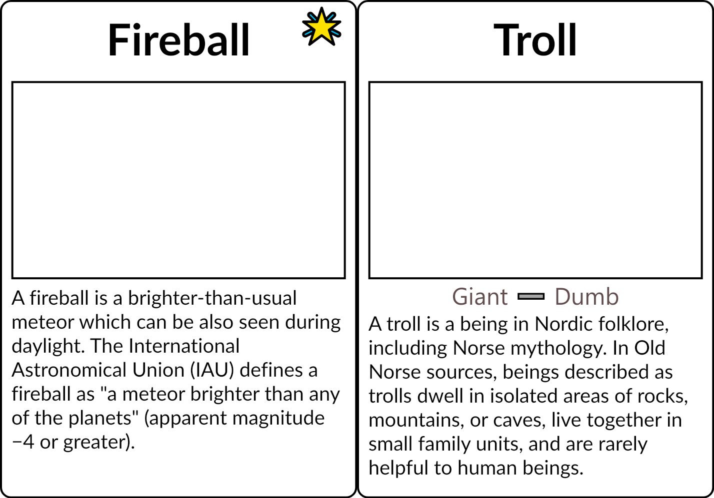
Example: A single template where the 'magic' star element has Condition: "{{Type}}=Spell" and the Textlist element for keywords has Condition: "{{Keywords}}" such that the element does not take space in the Column layout if it is empty.
NotCondition
NotCondition is the inverse of Condition — the element is shown when the expression evaluates to false, and hidden when it evaluates to true. Supports the same truthiness and comparison forms as Condition:
NotCondition: "{{Type}}=Creature"  // hide when Type equals "Creature"
NotCondition: "{{Cost}}>10"        // hide when Cost is greater than 10
NotCondition: "{{Name}}!=[[ListValue]]"          // hide when Name is different from the current ListValue
Cases
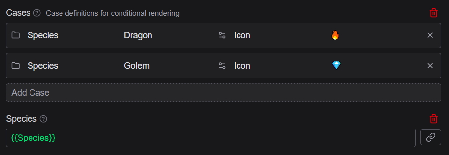
Cases defines multiple conditional rendering branches for an element. Each case specifies a condition and the element is rendered differently based on which case matches. Use this for elements that need to vary their content or appearance based on data values — for example displaying different icons or text based on a card's type category.
Example: The usage of Cases to show a different icon based on data (through a custom property). The resulting Icon property can then be used as text Source.
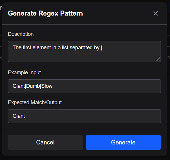
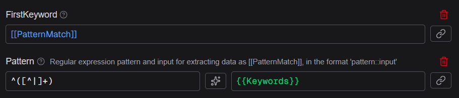
Pattern
Pattern extracts a portion of a data value using a regular expression and makes the result available as [[PatternMatch]] in the element. In the editor, Pattern shows two input fields:
- Pattern — the regular expression to match against (supports AI generation via the ✨ button)
- Input — the value to apply the pattern to, typically a
{{ColumnName}}data reference (supports the reference picker)
[[PatternMatch]] contains the first captured group from the match, or the full match if no capture groups are defined. Use this when you need to extract part of a data value — for example pulling a number out of a text field like "Level 5".
Example: Here a pattern is used to extract the first item in the sequence and then a custom property to name the output for usage in the template.
Lookups
Lookups defines lookup tables that map input values to output values using triple-curly {{{LookupName:KeyColumn=KeyValue:TargetColumn}}} syntax. Each lookup is a named spreadsheet. Use lookups to keep shared values in its own spreadsheet for easy editing and ensuring consistency across assets.
For more details read the Lookups Advanced documentation.
Border
Border sets the width and color of a border drawn around the element, where width is in millimetres and color is a CSS named color or #RRGGBB hex code. The default is 0 and Black (no border).
Border: "0.5" and "Black"       // thin black border
Border: "1" and "Red"           // red border, 1 mm thick
Border: "0.5" and "#FF0000"     // red border via hex
Border: "1" and "[[ThemeColor]]" // border using a constant reference
In the editor the Border field shows two inputs side-by-side — the width field on the left with its own reference picker, and the color field on the right with its reference picker and color picker button.
Spacing
Spacing adds a gap between child elements when the parent element's Mode is set to Row or Column, measured in millimetres. Use this to add breathing room between items in a horizontal or vertical layout without adding individual margins to each child.
RelativeWeight
RelativeWeight controls how much space an element occupies relative to its siblings when inside a Row or Column layout. The default value is 1. An element with RelativeWeight: 2 receives twice as much space as a sibling with RelativeWeight: 1. Use this for proportional sizing — for example giving a card image area 60% of the width and a stats panel 40%.
AutoWeight
AutoWeight is available when the parent Mode is Row. When set to true, the element is sized based on its content rather than by RelativeWeight. This is useful for elements that should only take as much space as they need — for example an icon that is a fixed size next to a text label that fills the remaining space.
GridColumns
GridColumns sets the number of columns when the element's Mode is Grid. Children are placed left-to-right, wrapping to the next row after reaching this column count. The default is 2.
ChildGroupHeight
ChildGroupHeight sets a fixed height in millimetres for each row when the element's Mode is Grid. When set, all grid rows occupy the same vertical space regardless of their content size, ensuring a uniform grid appearance.
InnerBorderWidth
InnerBorderWidth sets the width of borders drawn between cells in a Grid layout, in millimetres. A value of 0 (the default) draws no inner borders. Use this to create visible grid lines between cells.
EvenChildren
EvenChildren is available when the element's Mode is Column. When set to true, the element's available height is divided equally among all children before rendering begins.
This height is enforced at the layout level — each child's container is constrained to that exact height regardless of the child's own content. This is useful for uniform lists, stat blocks, or any column where every row must occupy identical vertical space. Requires the parent element to have a known height (e.g. via Height or from its own parent's constraints).
InnerBorderColor
InnerBorderColor sets the color of the inner borders between grid cells when InnerBorderWidth is non-zero. Accepts #RRGGBB hex codes, CSS named colors, and [[ConstantName]] constant references. The default is black.