Quickstart
Create your first project, add an asset. Then render your first card images and into a printable PDF in Board Game Builder.
Quickstart
This guide walks you through creating your first project, adding an asset with a data source and template, and rendering your card images and generating a PDF.
Creating a project
Click the New Project button on the main page to open the project creation dialog.
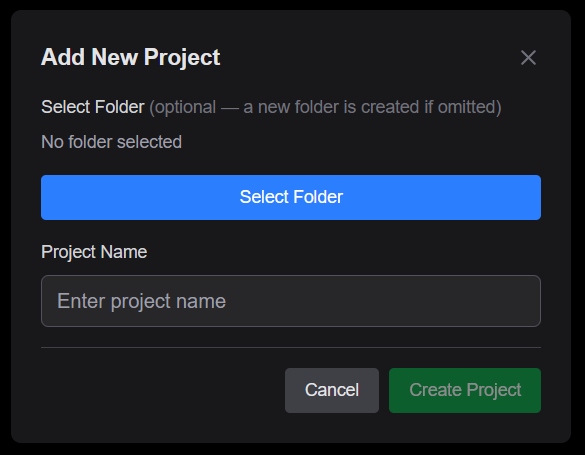
| Field | Description |
|---|---|
| Project name | A name for your project (e.g. "My Card Game") |
| Google Drive folder | Optionally select an existing Drive folder to store your project files. If left empty, a new folder is created automatically |
Click Create Project to confirm. The new project appears in the project list on the main page.
Adding an asset
Inside your project, click the button to open the Add Asset wizard. An asset represents one renderable component of your game — for example a deck of cards, a set of tiles, or reference sheets.
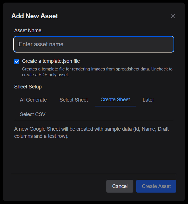
Asset name
Enter a name for the asset (e.g. "Character Cards"). This name is used as the folder name in Google Drive.
Template file
The Create a template checkbox is enabled by default. Un-check it if you only need a PDF-only asset for existing images.
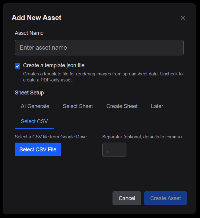
Sheet setup
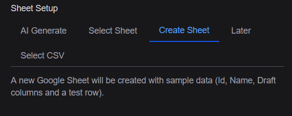
Choose how to connect your data source using one of the available tabs:
| Option | Description |
|---|---|
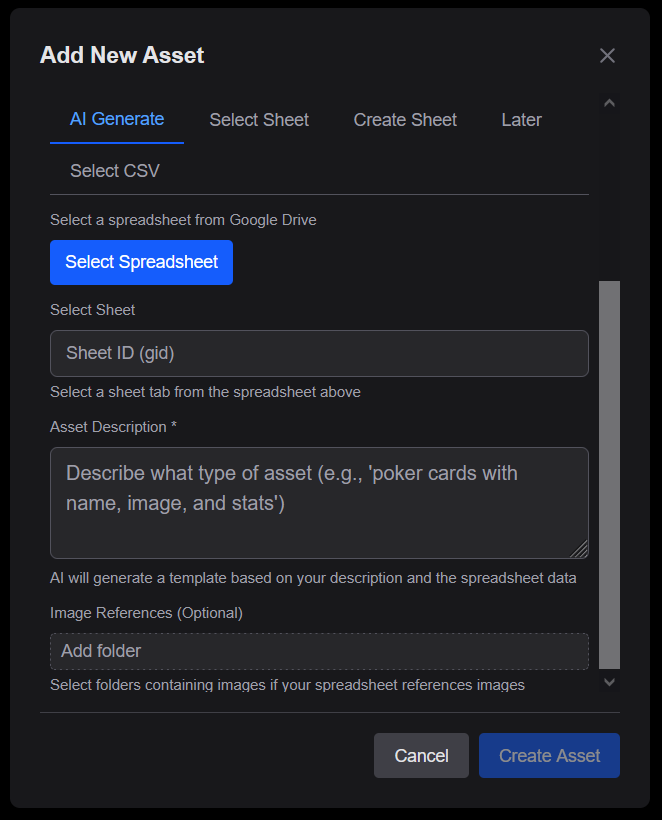
| AI Generate | Describe your spreadsheet and optionally provide image resources — an AI-generated template is created automatically |
| Select Sheet | Link to an existing Google Sheet from your Drive |
| Create Sheet | Create a brand-new Google Sheet pre-filled with sample data columns |
| Later | Skip data setup for now and configure it later in the editor |
| Select CSV | Link CSV file in Google Drive as the Sheet |
AI Generate
Provide a text description of the cards you want to create. Optionally select a Drive folder with image resources. Board Game Builder generates a template based on your description and spreadsheet data.
Select Sheet
Pick an existing Google Sheet from Drive. The first row is used as column headers.
Create Sheet
Creates a new Google Sheet inside the project folder with sample columns (Id, Name, Draft, etc.) so you can start creating new asset data.
Select CSV
Choose a CSV file in Google Drive as your data source. You can optionally specify a custom column separator (default is ,).
Click Create Asset to finalize. The new asset appears in the project's asset list.
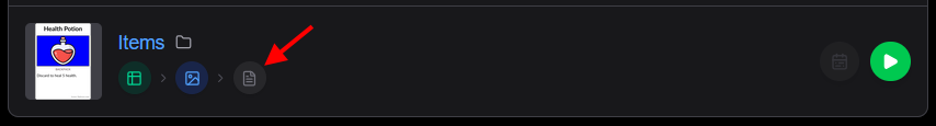
Asset list items
Each asset in the list shows a thumbnail preview and a set of stage-flow buttons that represent the three main steps of the asset pipeline.
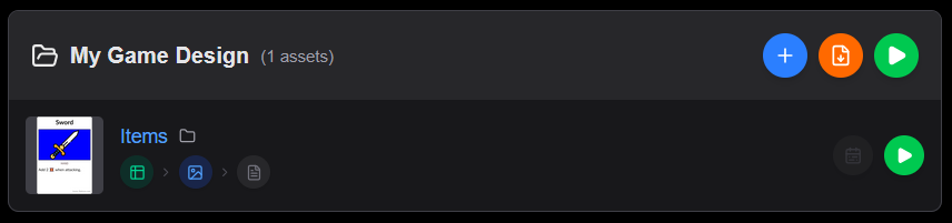
Stage-flow buttons
The three stage buttons are connected by arrows to visualize the pipeline:
| Button | Icon | Description |
|---|---|---|
| Data | Opens the linked spreadsheet. If no sheet is connected, prompts you to add one | |
| Template | Opens the template editor. If no template exists, prompts you to create one | |
| Layout | Opens the PDF layout/configuration editor. If no config exists, prompts you to create one |
Each button is highlighted when the corresponding stage is configured, and dimmed when it not set up.
Quick actions
For each asset item you'll find:
| Button | Description |
|---|---|
| Render | Renders all card images for this asset |
| Render Changes | Renders only data modified after a specific date (visble with PDF config) |
| Folder | Opens the asset's Google Drive folder |
| Opens the generated PDF output (visible after a PDF render) |
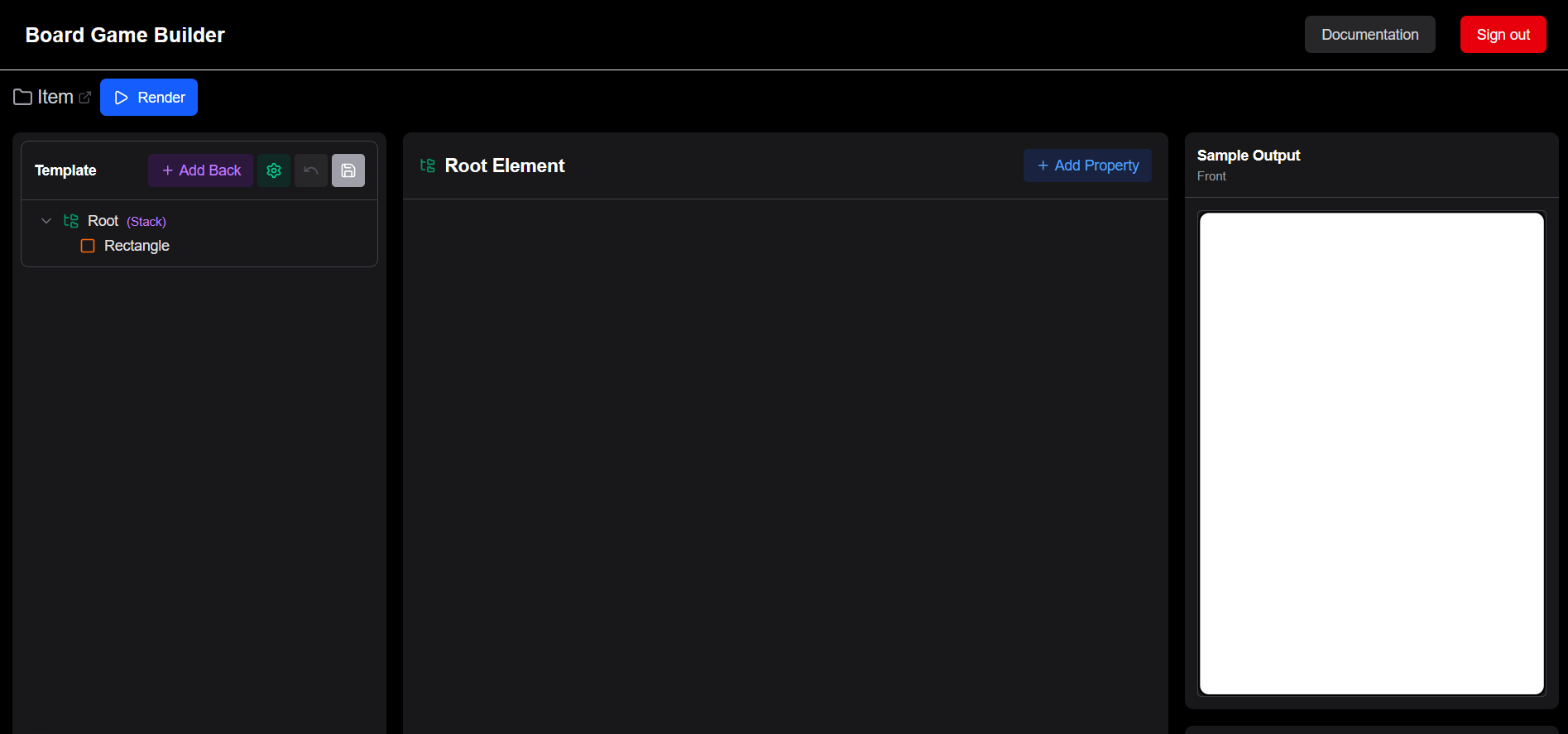
Setting up the template
Click the Template button ( in stage-flow buttons) or the asset itself to open the template editor.
The editor is split into three panels:
- Left — template structure: the hierarchy of elements that make up your card. The Root element is always at the top.
- Center — editor: when selecting an element such as a Text or Image in the template its properties are changed here.
- Right — preview: the rendered card (top) and the values of the currently shown row (bottom).
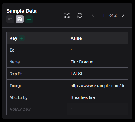
Below the card preview is the sample data panel, which shows the data rows from your connected sheet and lets you edit them directly without leaving the app.
Adding data columns
The sheet already has an Id, Name, and Draft column from when the asset was created. Add two more columns — Image and Ability — directly in the sample data panel:
- In the sample data panel click the button next to
Keyto add a new column and name itImage - Click again and name the second column
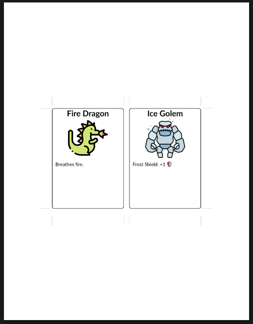
Ability - Fill in the first row:
- Name —
Fire Dragon - Image — paste a direct URL to any image you want to use as card art (you can set up a private Google Drive image folder later)
- Ability —
Breathes fire
- Name —
- Fill in the second row with different values, e.g.
Ice Golem/ (another image URL) /Frost Shield: +1 🛡 - Click Save in the sample data panel to write the changes back to the sheet
The card preview updates to reflect the first row, but shows no changes since we are not using any of the values yet.
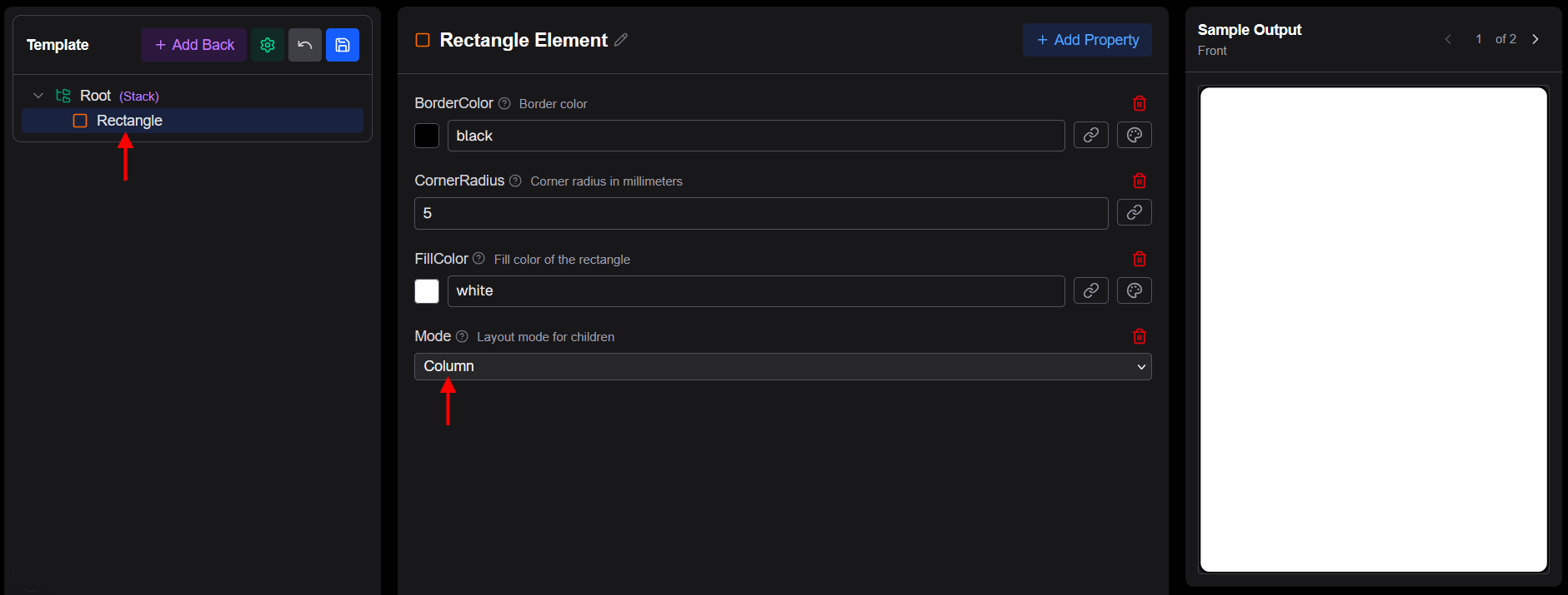
Adding a Rectangle container
The card currently has a Root element with a Rectangle that will acts as a card background and will hold all child content:
- Select the Rectangle in the tree view and select "Add Property" selecting Mode property. Set it to
Columnafter adding it. This lets its children stack vertically inside it from top to bottom.
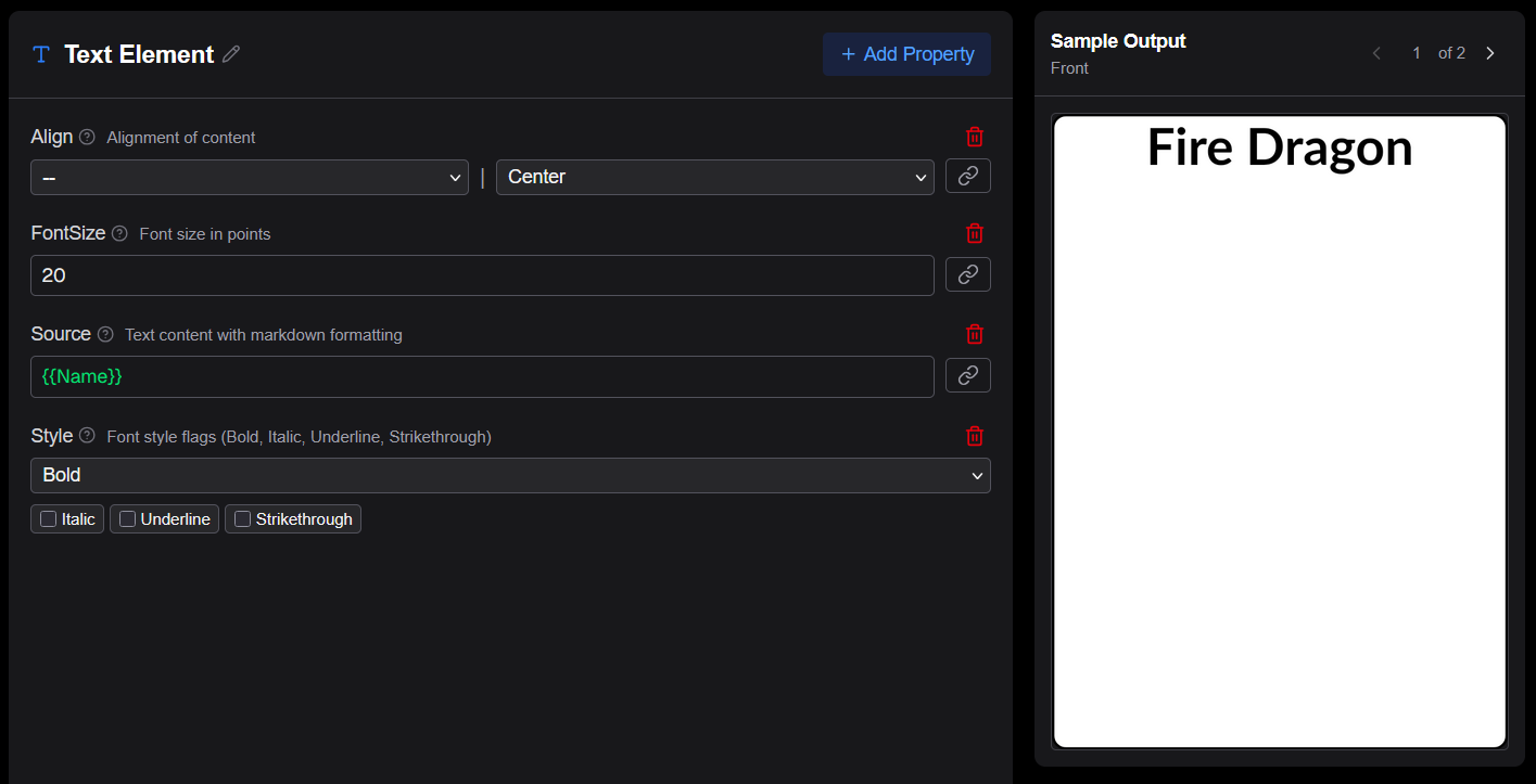
Adding the card name
Add a Text element as a child of the Rectangle on the Rectangle in the tree view and clicking on +. This will be used to display the card name:
- Hover the Rectangle with the cursor and click on the icon node in the element tree and then select Text
- In the properties panel add and set the following properties:
- Align →
Center - Style →
Bold - FontSize →
20 - Source → click the reference picker ( icon next to the field) and in "Data Reference" select the Name column
- Align →
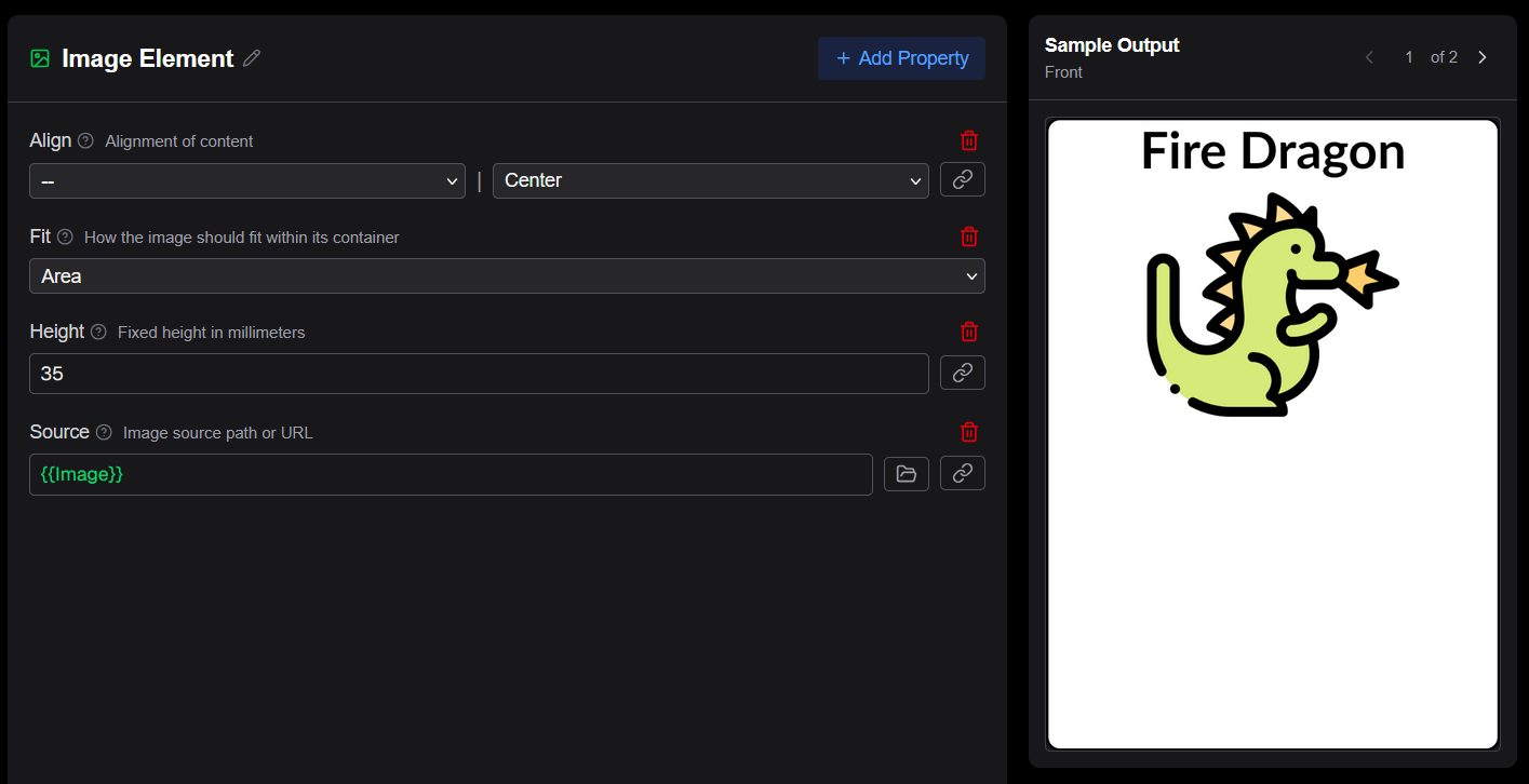
Adding the card image
Add an Image element as the next child of the Rectangle:
- Click on the Rectangle node and select Image
- In the properties panel find Source, click the reference picker (), and select the Image column.
- In the properties panel add and set the following properties:
- Align →
Center - Height →
35 - Source →
{{Image}}
- Align →
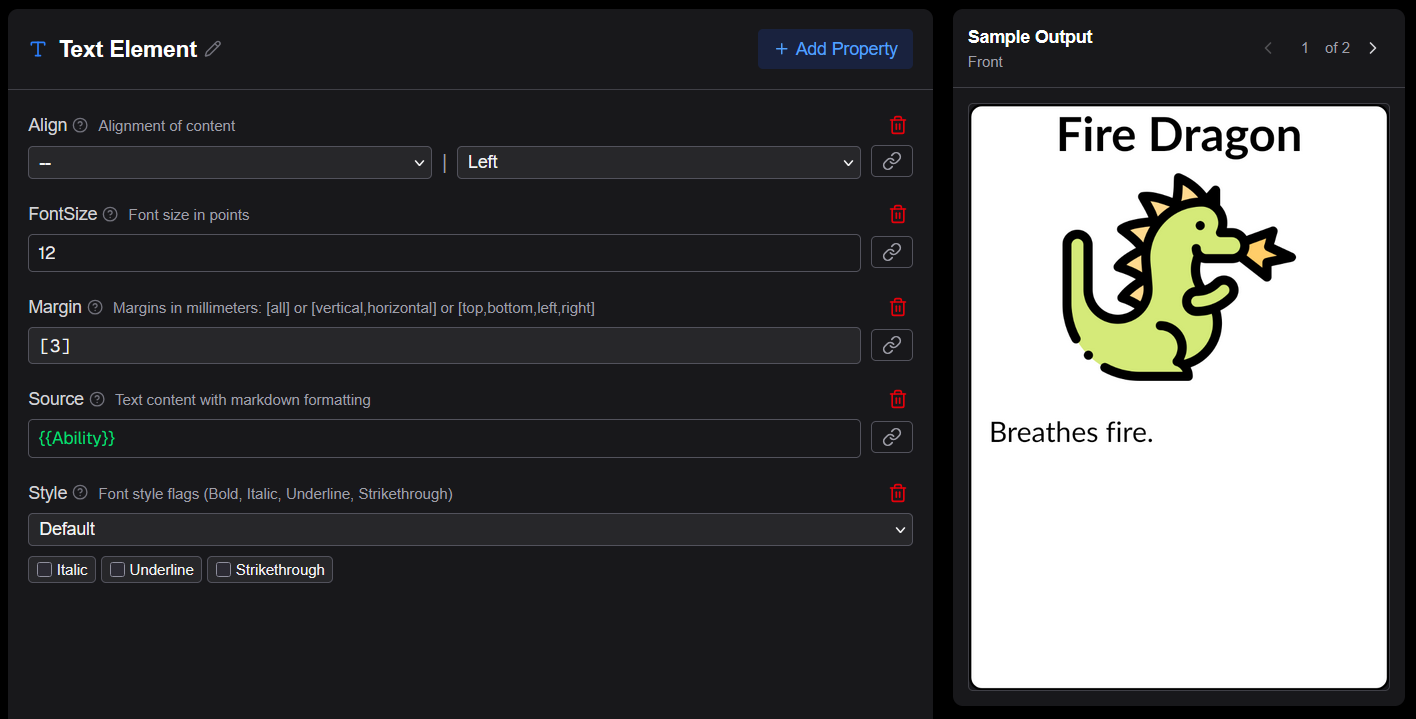
Adding the ability text
Add a second Text element as the last child of the Rectangle for the ability:
- Click on the Rectangle node and select Text
- In the properties panel add and set the following properties:
- Margin →
[3] - Source →
{{Ability}}
- Margin →
The element tree should now look like:
Root
└── Rectangle (Mode: Column)
    ├── Text  (Name, Center, Bold, 20pt)
    ├── Image (Image)
    └── Text  (Ability)
Click Save in the toolbar to save the template. You can nagivate to the other row(s) in the Preview to see how they look.
Configuring the cards layout
Before rendering a PDF you need to create a cards config for the asset. Go back to the main page and click the Layout button (document icon) in the asset list item's stage-flow buttons.
Because no config exists yet, the editor opens a New Cards Config dialog. The default settings work well for most standard card sizes, so simply click Save to create the config with the defaults.
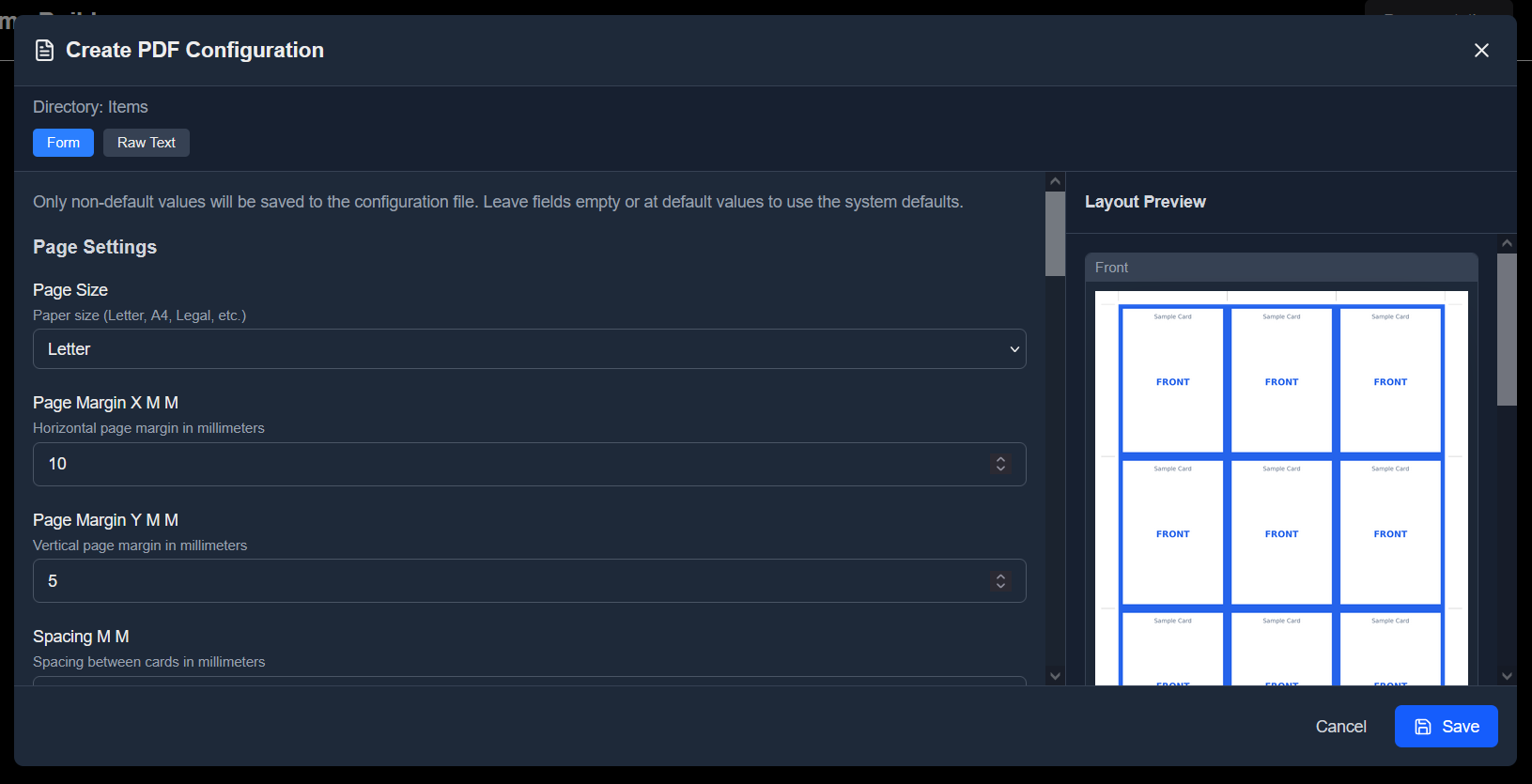
The Layout stage button in the asset list item is now highlighted, indicating the config is set up and the asset is ready for PDF rendering.
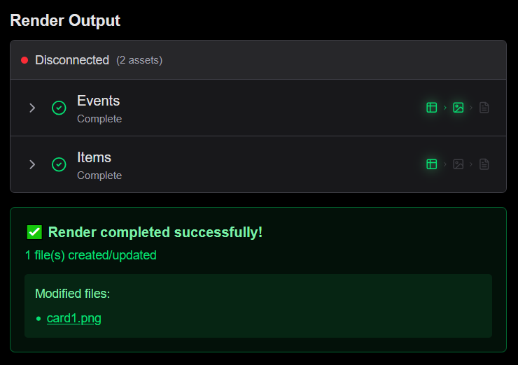
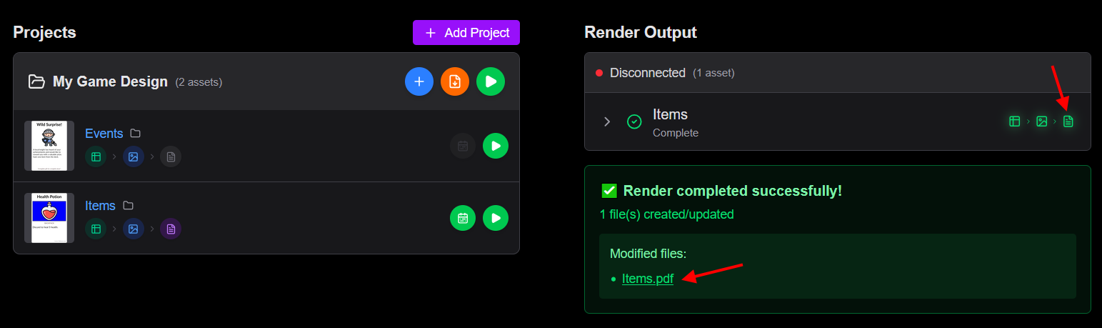
Rendering output
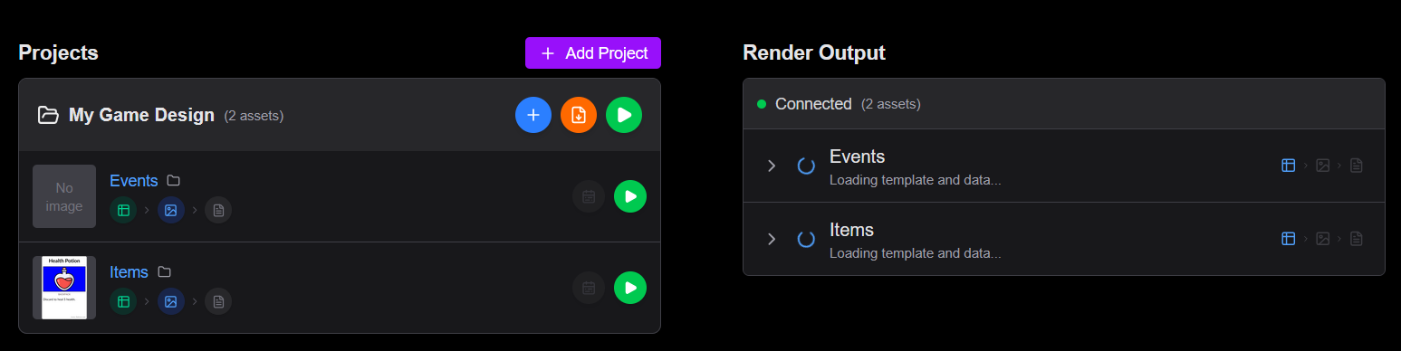
Click the Render button on an asset or the Render Project button to generate card images. The workspace splits into a two-panel view: the project list on the left and the render output on the right.
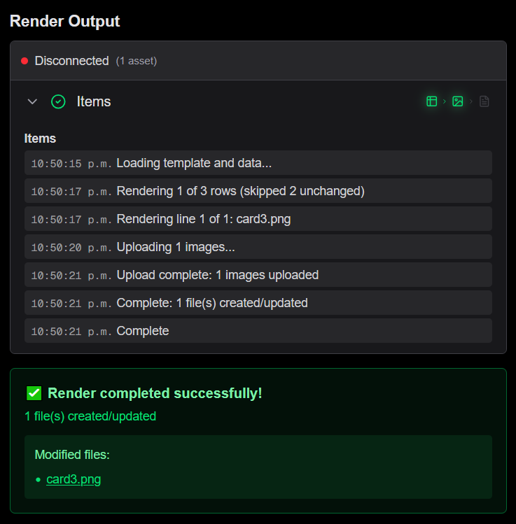
Progress tracking
The output panel shows real-time progress messages as each card is rendered. When rendering a full project with multiple assets, each asset's progress is tracked independently.
Render results
Once rendering completes, the output panel shows:
- A success banner with a count of files created or updated
- A scrollable list of output files with links to open each image in Google Drive
- If an error occurred, a red error banner with the error message
Render modes
| Mode | Description |
|---|---|
| Render | Generates PNG images for every row in the data source |
| Render PDF | Generates a print-ready PDF with all cards laid out according to the PDF layout settings |
| Render Changes PDF | Generates a print-ready PDF for images that changed after a given date (format YYYY-MM-DD) |
Checking the PDF output
After a Render PDF completes, click the PDF button in render output stage to open the generated PDF in Google Drive (or the PDF filename in the render results).
The PDF contains all rendered cards arranged on pages according to the cards config you saved earlier. Review it to confirm card sizing, margins, and bleed look correct before sending to print.
Next steps
Once your images are rendered, you can refine your template, add more data or create other assets for your game.
- Sheet source data — configure your data source in detail
- Templates — understand the template tree and element hierarchy
- References — bind data to template properties
- PDF layout — set up print-ready output